Monday, January 9, 2012

NON-OBJECTIVE


Hello all! I'm back from the dead yet again. I'm here to show yet again another piece I have created for my CyberArts class; dubbed "composition 1SS." For class, we had to choose to either do a silhouette, a non-objective painting, or create art playing cards. Since I liked the idea of doing a painting, I chose to do the non-objective piece.


For my piece, I used acrylic on stretched and primed canvas. By definition, non-objective refers to an image without reference to reality, or if it is derived from reality, it must be unrecognizable as that object. The main objective of this piece was to derive from architecture in our neighbourhood, an interesting composition; While walking home one day, I found a pole, sticking to the side of a building, the area looked quite unkept, and the pole rusted underneath the thin coat of white paint; neglected and decaying. I found this very interesting, and I came up with a way to incorporate it; a diagonal composition, and a repeated pattern.

I am particularly happy with how the off white balanced with the rest of the colours and shades in the piece, particularly working well with the black, while the flat background worked to contrast the texture, without creating too much juxtaposition.

Although I do think planning is very important, I am more of a fluid artist; ideas come to me halfway through a project, and I incorporate them. This is one of the projects that that way of thinking has helped me out the most, I was able to create quite an interesting composition, texture, and visual approach, and is probably the only piece that I am truly happy with, and I would not change it for the world.

Wednesday, October 5, 2011

Anatomy of emotion


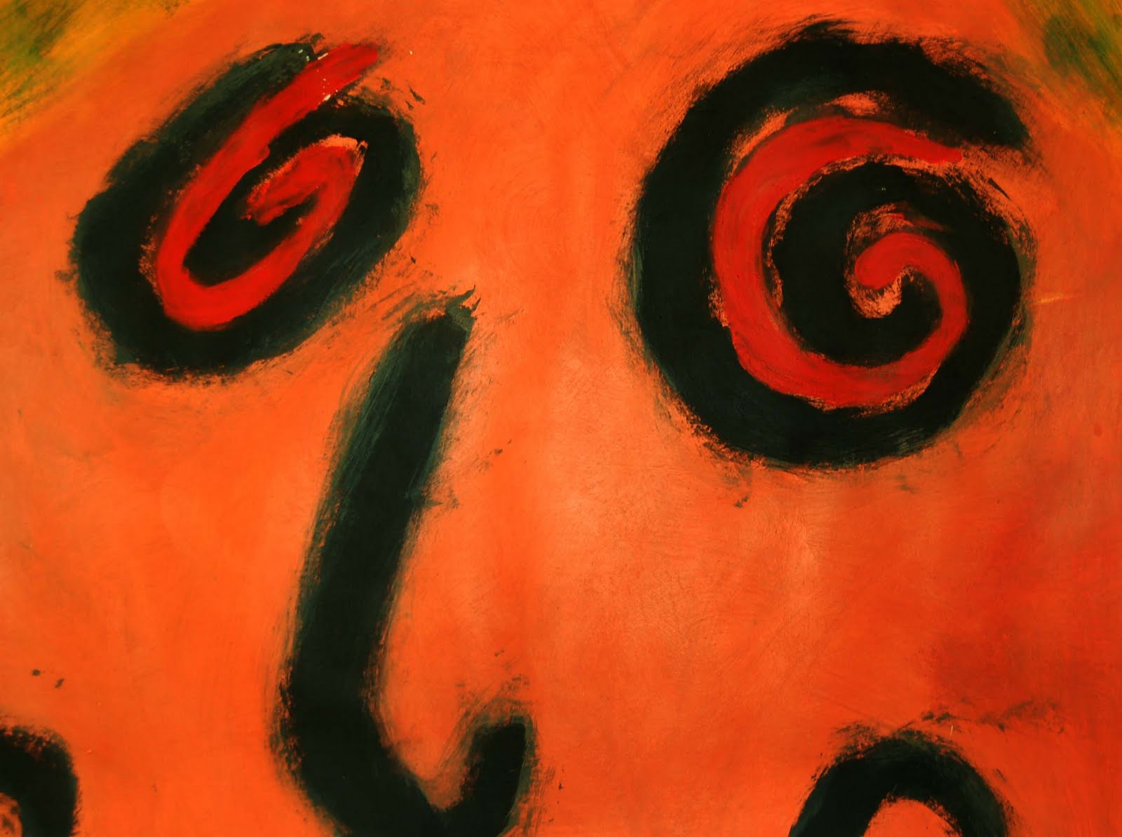
As my most recent piece, I decided to create something that was representative of me instead of my insights and surroundings (As most of my pieces do) I decided on a piece that would define and illustrate parts of my personality that most people may or may not see on a regular basis, I chose to display two important parts of my personality (for better or worse) Anger/Passion, and Indifference, you may be thinking "Huh S*****n, thats THREE personality traits!" Well, to me Passion and Anger are of the same kin, for me to be angry, I have to be passionate about it, and to be passionate about something, I have to Invested enough to defend it. Indifference is basically the polar opposite of Passion, and represents my lack of an ability to care about the little things, sometimes coming across as an ass (I KNOW right???). The cool colours represent the Indifferent side, while the warmer contrasting colours represent my more Passionate side.


I have dubbed the piece "Anatomy of emotion"; the piece to me was conceptually easy to form, the idea for the look of the piece just seemingly popping into my head, but was physically difficult to create, in a way; I knew what I wanted, but at the same time, I wasn't sure how to apply it in reality, I bounced back and fourth between mediums; paint, gel-medium, simple contour, to even some more crazy things. But in the end I settled on contour and marker; mainly because marker is one of the mediums I have actually never explored truly, where with paint, pencil/pen, I am quite well versed, and I wanted to try something new (despite never even picking up a marker before!) because in art, experimentation is one of the core principles to follow.

One of the things I was quite happy with was how well the colours work with each other, using complimentary contrast to my advantage to create a unified piece; where I think if I had used another set of colours, the piece would have felt more unbalanced. For this piece I really used quite a Smorgasbord of mediums; from ink to pencil-crayon, water-colour to marker, I really tried to make this very different compared to what I usually do, "Time to experiment!" I said. Even though my choice of mediums seems quite random, it is quite the opposite, while I used marker and ink to create the foreground of my piece I also wanted a background that was very distinguishable from the focus of the viewer, while keeping it unified through the use of complimentary contrast, using water-colour and pencil crayon (sparingly!).

The one thing that somewhat disappointed me was the fact that I was unable to create the same emotion as the original sketch I drew, that I felt had a lot more raw lines making up the piece, which I was unable to achieve due to the clean look I was going for, although I do feel my message is quite clear, and despite this, I do believe my piece is quite successful.

Friday, September 16, 2011


Hello! A piece that I found quite interesting on my travels through the treacherous interwebs was a piece created by Henri Matisse; Self-Portrait in a Striped T-Shirt.


Self-Portrait in a Striped T-Shirt. 1906. Oil on canvas. Statens Museum for Kunst, Copenhagen, Denmark. 55 x 46 cm


Henri Matisse was a french painter born in 1869 who was a was also a printer and a sculptor but is well known as a Fauvist painter. Henri Matisse was considered a forerunner for the fauvist art movement, and was seen as one of the most famous of the Fauvists to this day.


The reason why I think this piece stood out to me was how different the piece looked to me compared to his other pieces, where many of his oils seem to be very neat, while these brush strokes seem quite violent yet thoughtful, and where (In my opinion) the fauvist style aids the painting rather than ills it, the vibrant and complementary colours, the harsh, violent brush strokes really make it a memorable piece. Before seeing this piece, i wasn't a fan of fauvism, but now my eyes have truly been opened, and I now see the style with fervour.


Monday, April 11, 2011

VIDEO ON TRIAL

Ah. Here I am again, back from the dead! I'm here to share with you a "Video on Trial."


Case #1, The first video I'm going show is one of my personal favourite songs, "Nothing to Lose" by Billy Talent. One of the main reasons why I like this music video is at times I can relate to what is being said in the song, and It helps. I personally like the filter they used, and the shots are very fluid, overall it is a very story driven video, this is why I think it succeeds.


Case #2, this is a video I dislike greatly... from... *sigh* Bon Jovi... well, the song is "Have a Nice Day" The shots are dull, there is no continuity, no filters, no meaning. This is the definition of stupid.

Saturday, March 26, 2011

Romanticism Prints!


This past moth, our class has been studying Romanticism. Romanticism was an art movement that came around in the art explosion that was the Renaissance era that commonly used literature, legend, and important events to express imagination, extreme emotion, and symbols. In a way, it was the punk rock of the Renaissance. I chose to do a dry-point print based on the ideas and ideals behind Romanticism.


This is my very first print. The concept of this print was, in a way, a kind of "hell" that the character is shown in, and shows a constant cycle of styles as conformity. One hand draws his identity as contemporary (blue jeans, t-shirt) while the other erases him in place of a suit and slicked back hair. As most people do, I chose to ink my first print in black, the first print was very much a learning experience for me, as you can see, the washed out print is due to two things, I wiped away too much ink, and I didn't set the printer low enough. I myself was initially disappointed, but as I thought about it more, i came to the realization that to me, the first print was a learning experience.


On second Print I hit my stride, the pressure on the press was right, and the ink was deep enough into the plate to make an acceptable imprint on the paper. I used colours that seemed similar to what would be portrayed in reality, such as the pink eraser, a relative

skin-tone, and pencil. On this print, I used a palate of warm colours, but at the same time, used cool colours to keep the piece interesting. originally, I was understandably edgy about the use of yellow in my piece, I was worried that the yellow wouldn't stand out, or be difficult to see. Upon seeing this, I added some brown and orange to the yellow, and the final colour was better than I expected, I am very happy with this piece.


The Intent for my final print was to either to use a cool or warm palate exclusively. In the beginning I felt the need to do something a little different than before, but after some deliberation, I settled on a warm palette, but different than the previous print because it focused on the main focal point, some of the smaller things were not inked.

Saturday, March 5, 2011

The Pastel Wars


First of all was my pastel cropping, which I chose for the golden rule composition, in which the right"swirl"/eye is the main focal point.


For my first piece, I found myself fairly irritated with the lack of precision i was able to attain, although I do think it turned out quite well.


For my Final Piece, I think this is my favourite piece due to really only the large amount of precision I was able to attain. Although I personally think that the brushstrokes are more
lack-lustre than I would of liked. Overall I prefer working on a small scale, and I am happy with my pieces, I don't usually paint on a large scale like this, so it took me a little bit out of my comfort zone.


Friday, February 4, 2011

My Music Video

As you can see, I have posted a video that me and my friends personally made, it is a music video for the band billy talent, the song is white sparrows. The song depicts an up and down relationship, that in the end, only awards death, the man is heartbroken and... well.. you'll find out for yourself, just wait for the credits to roll. Enjoy.